I had the privilege of designing the branding and the UI Style Guide for Rushabh Instruments. These two essential components played distinct yet interconnected roles in shaping the company’s image and facilitating effective development. Here’s an overview of my contributions:
Branding:
▶ Brand Identity: I crafted a unique and meaningful brand identity that captured Rushabh Instruments’ core values and mission. This identity served as the foundation for the company’s visual representation.
▶ Logo Redesign: I had the opportunity to redesign Rushabh Instruments’ logo as part of the branding efforts.
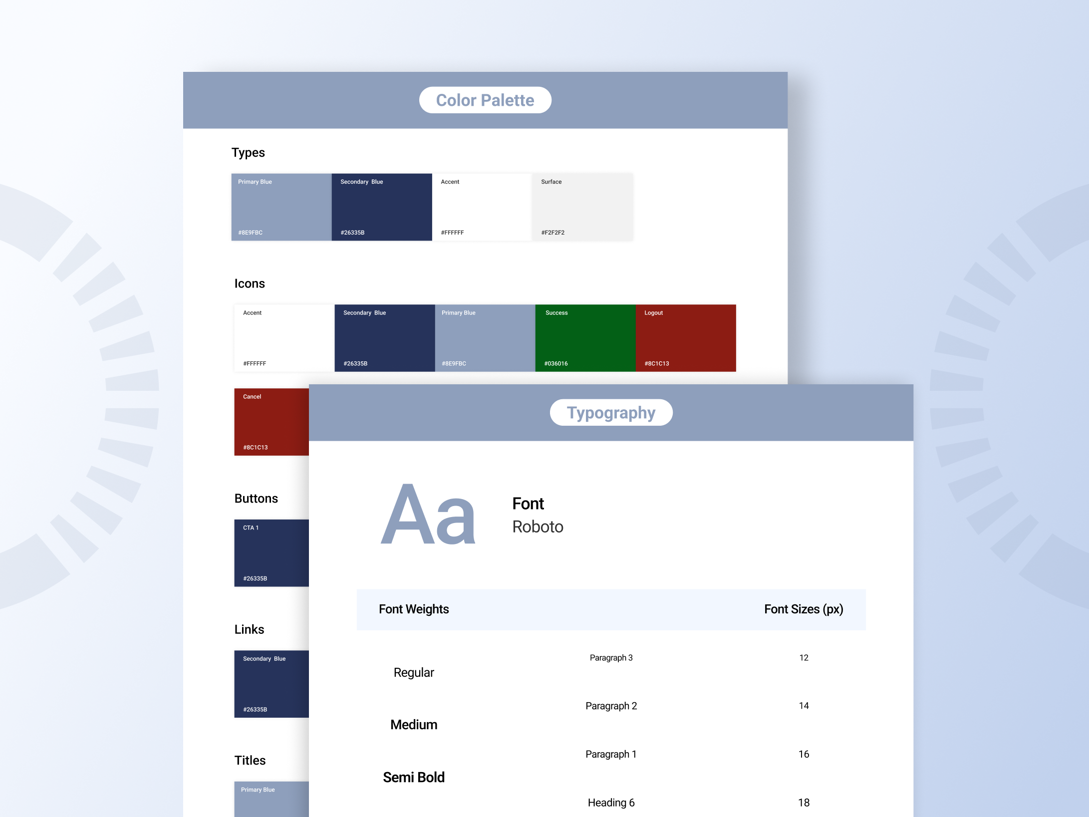
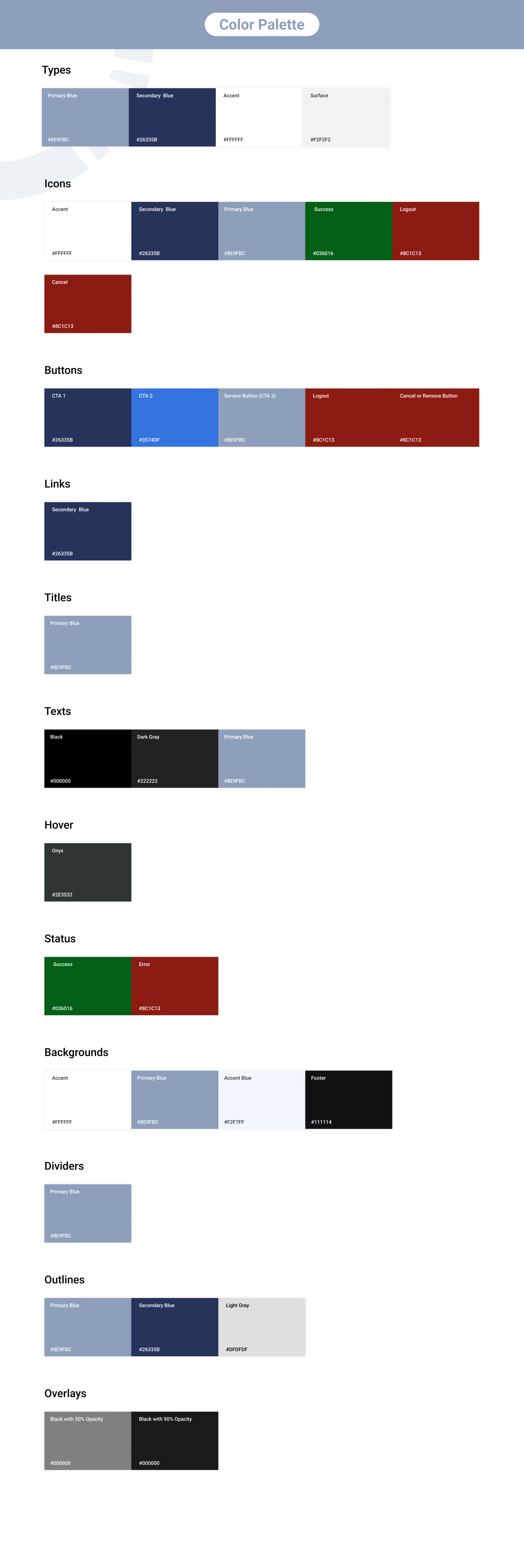
▶ Color Palette: I carefully selected a color palette that resonated with the company’s ethos and communicated the desired emotions. These colors were thoughtfully integrated into the broader design scheme.
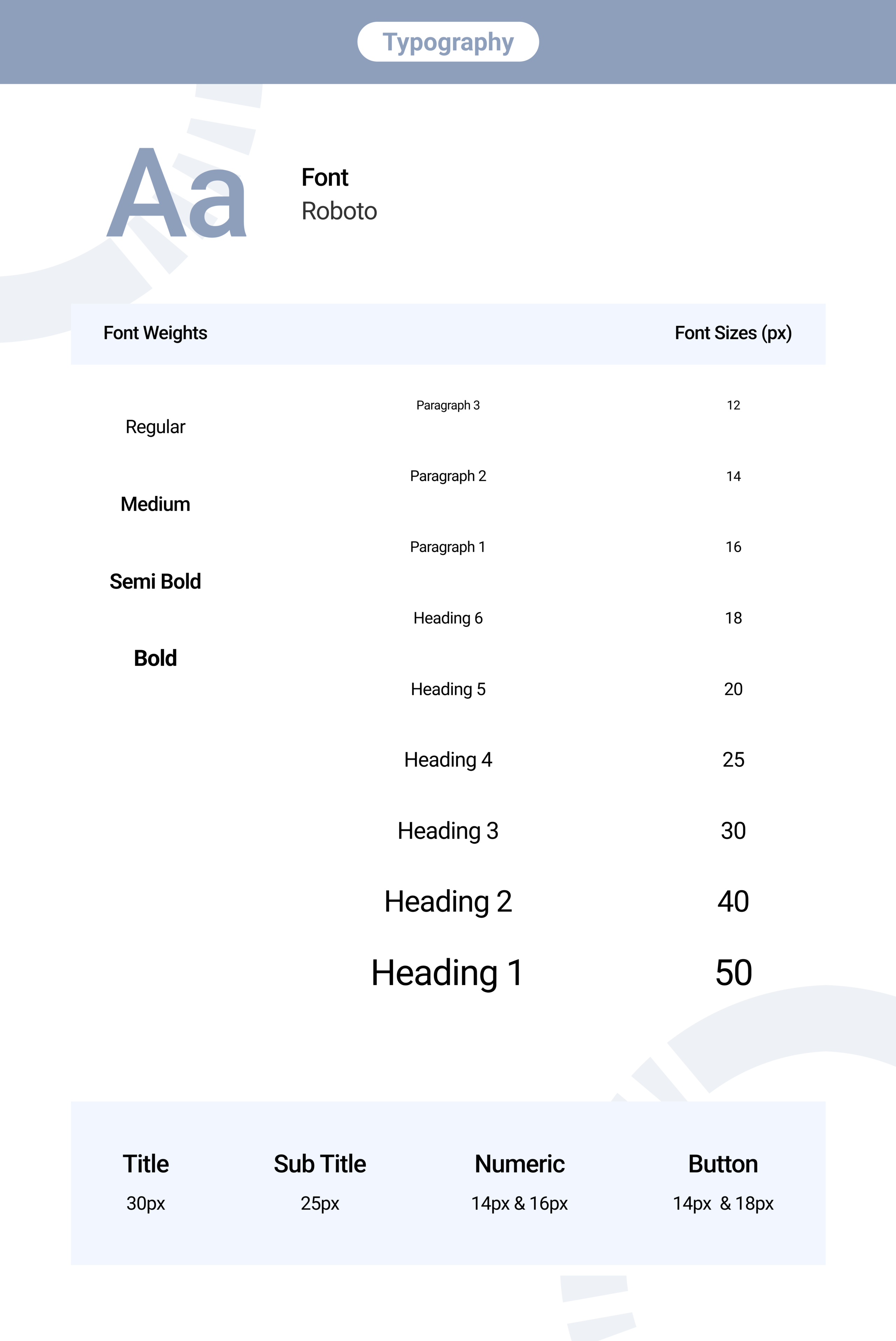
▶ Typography: I defined the primary typography choices for the brand, ensuring they reflected professionalism and enhanced readability while reinforcing brand recognition.
▶ Visual Elements: I introduced visual elements and design motifs that would become synonymous with the Rushabh Instruments brand, contributing to a consistent and memorable visual identity.
UI Style Guide:
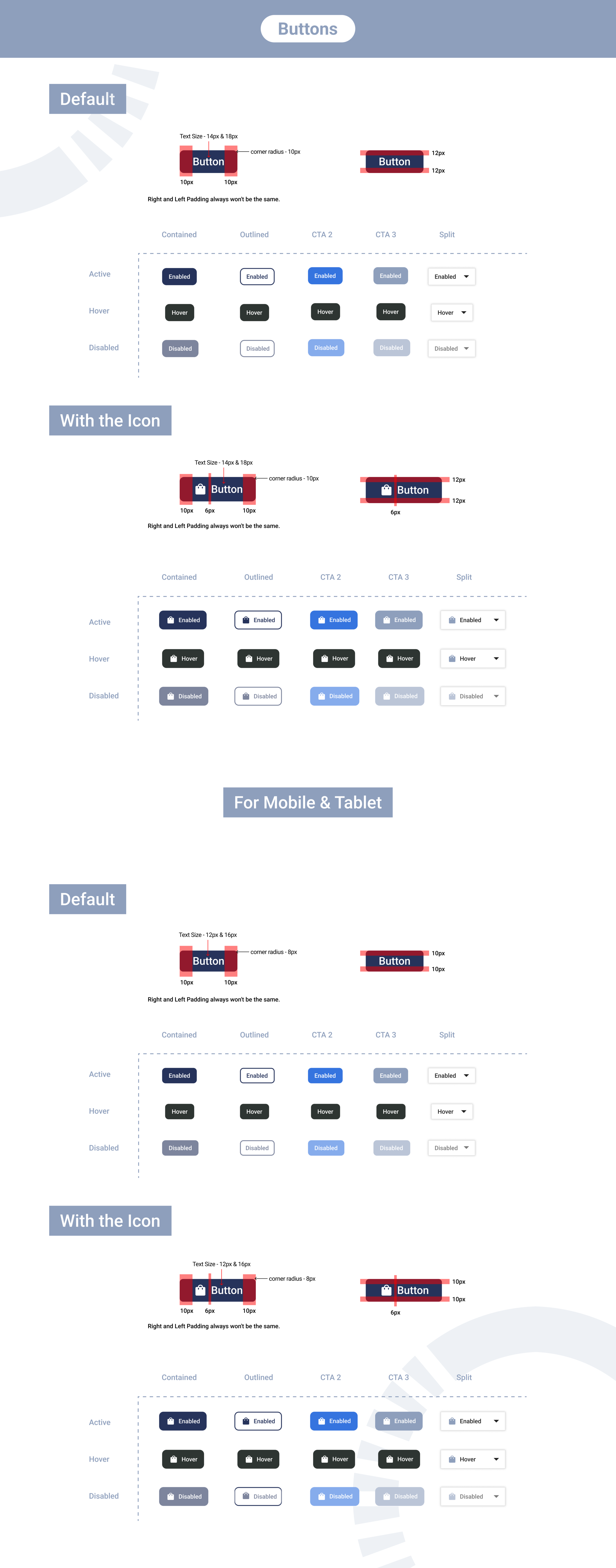
▶ Development Support: The UI Style Guide I created was primarily aimed at assisting developers. It provided them with a comprehensive resource to ensure the consistent application of design elements and principles throughout the website’s development.
▶ Visual Consistency: I seamlessly integrated the brand identity elements into the UI Style Guide to maintain visual Consistency. This ensured that the website design reflected the broader brand aesthetic.
▶ Unified Color Scheme: The Style Guide reinforced the established color palette, specifying color codes and detailing their application across the website to maintain a cohesive look.
▶ Typography Guidelines: I included typography guidelines within the Style Guide, emphasizing the importance of using designated fonts consistently to uphold brand cohesion.
▶ Logo Usage: Detailed instructions were provided on how to use the logo across different contexts, ensuring it remained visually impactful and aligned with the brand’s identity.
▶ Branding Assets: The Style Guide featured downloadable branding assets, including high-resolution logo files and brand-specific graphics. These resources were readily available for reference and use by the development team.
▶ Brand Application: While the primary focus was on the website, the Style Guide’s principles could also extend to other applications, ensuring a consistent brand presence across various channels.
My work encompassed the creation of both the branding and the UI Style Guide for Rushabh Instruments. The branding aimed to establish a strong and meaningful visual identity for the company, while the Style Guide served as a practical tool to support developers in implementing this identity consistently across the website and other brand materials. These elements contributed to a cohesive and impactful brand presence for Rushabh Instruments.